Design Guide
How this site was made
Designing subtlety.
Halcyon's promise is work no one can point to. The site makes the same promise visually: nothing moves fast, nothing shouts, and the most technical element on the page reads as a drop of serum, not a demo. This page documents the decisions.
01 · Palette
Skin tones, not clinic tones.
No sterile white, no clinical blue. The palette is drawn from the materials of a luxury skincare house: alabaster stone, blush serum, rosewood, champagne-gold hairlines, espresso. Rosewood is the only voice raised above a murmur, and it speaks in single words.
Warm Alabaster
#F6EFE8
Blush
#DEB8A8
Deep Rosewood
#7A4A42
Champagne
#C6A87C
Espresso
#3A2E2A
02 · Typography
Lapidary and light.
Marcellus sets every headline — a serif drawn from Roman inscription capitals, carrying the authority of something carved rather than typed. It never bolds; it doesn't need to.
Outfit carries body and labels at light weights, with labels tracked to 0.34em — the typographic equivalent of a lowered voice. The pairing is a beauty house's: stone display, breath-light text.
Display — Marcellus
The best work is the work no one sees.
Body — Outfit Light
We decline more procedures than we perform.
Labels — Outfit, tracked wide
Aesthetic Surgery · Medical Spa · Austin
03 · Technique
Liquid, arches, and patience.
The liquid-morph hero
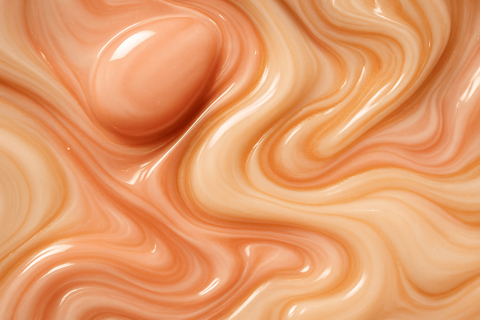
Five metaballs drift on slow sine orbits; their combined field is computed per-pixel on a 160×100 canvas and upscaled by the browser, which turns the low resolution into silk. Soft-threshold edges tint from blush to champagne-lit cream. It reads as serum merging and separating — surgical fluidity, abstracted.
The arch motif
Every image sits inside an arched frame with a champagne outline — the doorway of a treatment suite, repeated as a visual signature. Palette swatches, portraits, even buttons carry the rounded-top geometry, so one shape quietly owns the whole site.
Slow luxury motion
Reveals run 1.2 seconds with a blur-up, hovers take 1.4 seconds, color transitions 500–700ms. Nothing on the site moves at interface speed; everything moves at spa speed. The restraint is enforced by the system, and reduced-motion visitors get perfect stillness.
04 · Why it works
The design argument.
Trust through tone. Aesthetic surgery marketing usually sells transformation — before/afters, superlatives, urgency. Halcyon sells judgment. A site this quiet tells a prospective patient the practice won't oversell them in the consultation room either.
Beauty-editorial, medical underneath. The surface language is a skincare house; the substance — board certification, four patients a week, sealed records — is clinical. That inversion is the brand: luxury first impression, medical spine.
One deliberate contrast. Against sibling site Ridgeline Surgical's cool Swiss precision, Halcyon proves the same industry can be designed from the opposite pole — warmth, curve, and slowness — without losing credibility.